Using QR codes at historic sites and living history museums to meet the needs of mobile visitors was discussed recently in the closed LinkedIn group for the  Association for Living History, Farm, and Agricultural Museums (ALHFAM):
Question: How to Interpret a Living History Museum with QR Codes?
I am looking to design a QR code tour for our living history site and my problem is that there are so many possibilities that it's hard to narrow it down. What works? Where to start? Does anyone out there have a success story or advice to share?
Some of the respondents reported that they'd implemented these and had some statistics.
Using The History List is another option to meet the needs of all mobile visitors. Since our move to a responsive design is complete, a historic site can publish the URL to their page on The History List and users of smartphones and tablets can use it for a tour of the facility. Pages on The History List can have as much text and as many photos and videos as desired. There is no cost. More information on the way in which history organizations can use The History List, with links to examples.
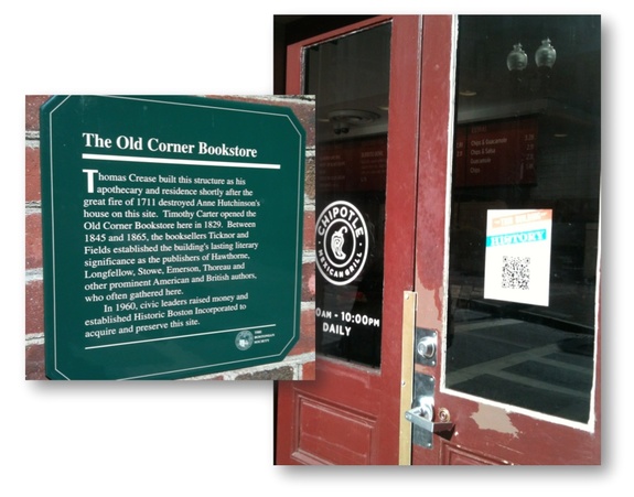
The discussion that follows is my response, edited slightly and with links added. The photos of the preservation month campaign "This Building Has History" from the Boston Redevelopment Authority and the Boston Landmarks Commission from May 2012—the signs were still up in February 2013 when these pictures were taken—are discussed below.
Using QR codes at historic sites and other ways to meet the needs of mobile visitors
If the goal is to increase a visitor's understanding of and interaction with a place, I'm skeptical of the utility of QR codes and am interested in seeing the key stats in Neil's report. Making your site— both your website and your physical site— easy to use for people on tablets and smartphones seems like  a smarter way to spend additional time and money.
The reach of QR codes
Based on the "20% of 50%" figure quoted, you're starting with 10% of your population who even has the ability to call up the information. If 1 in 4 people actually does—a very generous estimate—you're reaching 2.5% of your visitors.
Question: When was the last time you saw a QR code? Now, when was the last time you pulled out your smartphone and scanned a QR code? We notice the codes because they stand out graphically, not because we've scanned them and found great content.
Updated May 19, 2013: Rachelle Clayton added this anecdote to the original discussion:
I was recently at a tourism conference where the speaker was pushing QR codes and their benefits. I did a quick poll of the tables around me. Out of six tables of ten (60 people), all into social media and enhanced visitor experiences, 100% had smartphones or iPhones. One had ever scanned a QR code (in a provincial park), and only that person knew how to scan or even had the app to do it.
Responsive design as a way to reach mobile visitors
Instead of creating a tour based on QR codes, invest in a website built using responsive design. For an example of the way responsive design works, look at Old Sturbridge Village's page on The History List.
If you're on a laptop or desktop, take your browser window and re-size it—make it narrower, like a tablet, or narrower still, like a smartphone—and you'll see that the content automatically rearranges so that you don't have to zoom in to read it or scroll side to side.
With responsive design, users on all devices with browsers, including tablets and smartphones, are able to consumer your content just by visiting your site. They don't need a special app. A new report shows that 9% of all web traffic to US sites was from tablets and another 7% was from smartphones; both numbers continue to grow.
To go back to our thought experiment: When was the last time you used your tablet or smartphone to browse the web?
What responsive design means for historic sites and living history museums and facilities:
- Ensures that a growing percentage of your web visitors have a great experience. The design of some sites today makes them unusable on a smartphone. (If you wonder what your site looks like on the dozens of different combinations of devices, browsers, and OSs that your visitors use, there are online services that you can try our for free. We use crossbrowsertesting.com.)
- Enables you to forestall development of a dedicated application for iOS and Android. Or, if you already have created them, track the use of your apps and the cost to build and update them and compare that to the cost of creating and maintaining a single website that works across all platforms. (A dedicated app makes a lot of sense for folks like ESPN or American Airlines, but it's unlikely to generate a rate of return that's high enough for most of us.)
- Solves your outdoor use problem. Simply add the URL of the section of your site with your tour to your signage and materials, such as http://www.ExampleHistoricSite.org/tour. (For those with really long URLs, you might also print a URL that's created using a URL shortener, such as bit.ly or goo.gl.)
Responsive design options for historic sites and living history museums and facilities
- For sites built on WordPress or another content management system (CMS) that has a responsive framework: WordPress and some of the other CMSs that have responsive templates, so if your site was built on WordPress or another that has a responsive framework, talk with the person who handles your site about implementing responsive design.
- For sites built using other CMSs: It's become easier for developers to build these sites, which use HTML5 and CSS3, since the introduction of Bootstrap from Twitter and other frameworks. If your developer hasn't talked with you about this already, ask them.
- For all sites: Regardless of what you do with your own site, you can take advantage of your organization's responsive page on The History List. Listings are free. As you saw above, the organization pages are responsive. (Soon the entire site will be.) You can, at no cost, build out a page for your facility that is as long and detailed as you wish, with dozens of pictures and video clips and thousands of words of text on the page, and then publicize that URL. (Use a URL shortener, such as bit.ly or goo.gl to generate a URL that's much shorter to enter.) All at no cost, and without making any changes to your current site.
Learn more about the way in which your organization can use The History List to attract and serve visitors.
More about the photos above
The photos are of the "This Building Has History" May 2012 QR campaign from the Boston Redevelopment Authority and the Boston Landmarks Commission. The pictures were taken when I came across the campaign en route to an event at Old South Meeting House in February 2013.
The first one I saw was on the pillar. I thought at first it was a handbill. Once I got closer, I read the explanation, dug out my iPhone, looked through my apps to find a QR reader, scanned the code, and clicked on the link. This brought up a webpage with a PDF similar to to the one to the right. In order to read it on a smartphone, you had to zoom in and then scroll side to side and up and down. (The link returns a 404 error today.)
The irony is that they could have simply plastered the very same PDF on the pillar and skipped the QR code entirely.
The PDF to the right is the one that comes up when you scan the poster on the door in the photo above.
The green sign, which can be read easily by everyone, is nearby.
As with many programs that start out with good intentions, it appears that this became focused on a particular tactic (QR codes) and lost site of the goal (increase awareness and appreciation of historic buildings). One way to spot such a problem in advance is to think through the user experience carefully. And throughout, tracking expenditures and focusing on results helps you keep the program from drifting off-course.
Modifying the campaign
Here's what could have been done instead with a QR codes and some of these same assets:
- Develop a flier that has information about the building and has a QR code for additional information that doesn't fit or can't fit on the flier.
Using the one to the right as an example, remove the "Now" photo, which doesn't add any value when you're standing in front of the building, and put the QR code there. Link the QR code to a page with a slide show with pictures of the location over time or a video clip of someone who campaigned for the preservation describing those efforts or of an historian describing the importance of the Old Corner Bookstore.
In the case of this location, now a quick service restaurant, don't put the flier on the door people are using to enter and exit the store, but put it off to the side where someone can read it without disturbing others.
Reducing the density of text and adding bullets with key points or a pull quote will increase the likelihood that more people read at least part of the information.
For more information, and at the end of the campaign, rather than breaking the links, redirect them to a site that can easily be read on a smartphone—such as a site created using a responsive design.
 Everyone knows you’re supposed to use hashtags, but often they’re not used very well. Using a tag regularly that might be used by someone else (such as #thisdayinhistory, #history, #mapoli, etc) is a good strategy, but a really good way to boost visibility is to find ways to tie what you’re posting to what’s going on in the world. For example, we have used #pirates when the Pittsburg Pirates are being buzzed about. #Occupy and #OccupyBoston were handy during the Occupy Movement to post about the British Occupation.
 Association for Living History, Farm, and Agricultural Museums (ALHFAM)


 For immediate access, sign in with Facebook, or you can request a free account on The History List.
 include sleeping overnight. Yes, the icon shows a tent, but it's not meant to be literal. (If you can come up with an icon we use instead of this one, we'll sing your praises and send you a t-shirt. We tried dozens before settling on this one. The icon has to be easily recognizable and telegraphic at the very small size we use, and consistent with the design of the site. If you have one that meets those criteria,